Sounders unveil new crest, colors as 50th season approaches
Published 1:30 am Tuesday, September 26, 2023


By Jayda Evans / The Seattle Times
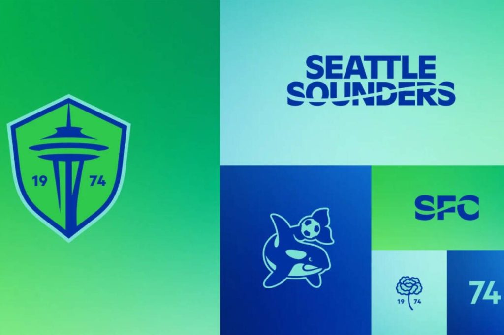
The Sounders unveiled a new crest and colors Tuesday. The refreshed look is a wink to the club’s history since established in 1974 and a nod to the future as the 50th year approaches next season.
Fans, community members and stakeholders were among the groups of people the Sounders front office reached out to for direction for the new branding. They also received more than 10,000 completed surveys, according to the news release.
“Today marks the culmination of much careful, contemplative and thorough work and it is incredibly rewarding to now introduce Sounders FC’s brand evolution,” club majority owner Adrian Hanauer said in a released statement Tuesday. “It was a dream achieved to bring the Sounders to Major League Soccer in 2009, but, like many of our fans, my love for the club started long before its MLS era. As Sounders, our past runs deep and proud and that’s why we’re especially pleased to introduce this new visual identity, which isn’t so much a change as it is an evolution that more faithfully encompasses the entirety of the club.”
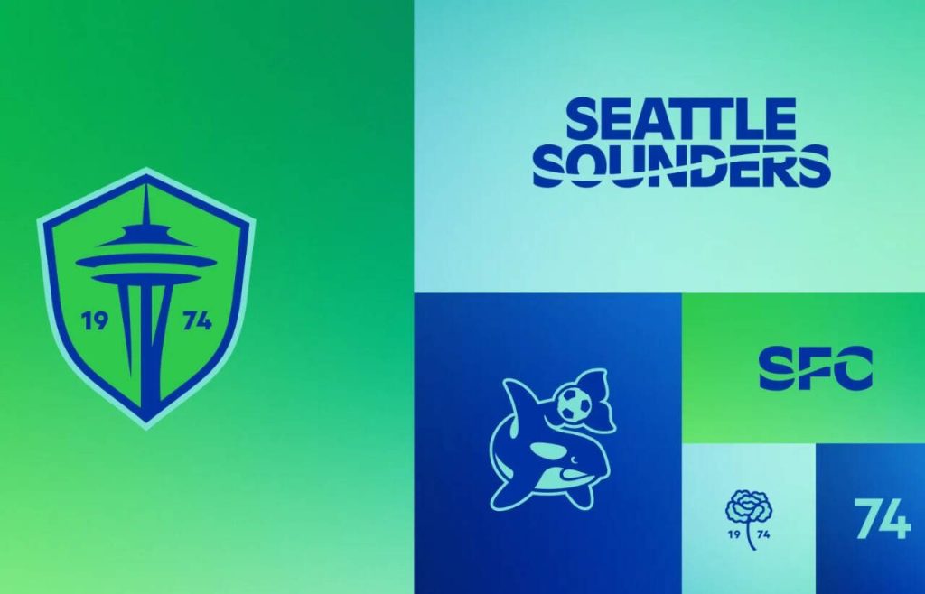
The Space Needle remains the centerpiece of the logo, but the banner stripped across that read “Seattle Sounders FC” was removed. Now imagery of the city’s iconic structure is flanked by the numbers “19” and “74” to highlight the club’s birth year.
Shading still reflects the supporters’ refrain “Eternal Blue, Forever Green” and the team’s Rave Green moniker. But a so-called Heritage Aqua that pays homage to the club’s inaugural color palette in 1974 was added to provide a path for more subtle merchandise.
For the tertiary marks, SFC is officially an abbreviated name for the club. The fan-favorite orca that cradles a soccer ball with its tail makes a return from the Sounders logo used during the team’s APSL and A-League era. Seattle Sounders wording with a wavy streak through “Sounders” or “SFC” from that era is also back.
A new addition is a silhouette of a stemmed carnation set between the numerical birth year. During the inaugural season at Memorial Stadium, Sounders players handed out carnations to fans after matches and the secondary logo rekindled that bond.
“The work we’ve unveiled is good, but, more importantly, it’s rooted in good work,” said Taylor Graham, the club’s chief revenue & marketing officer, in the news release. “We take a critical step forward in defining the next 50 years of Sounders FC.”
SFC will finish the remainder of this season under the current crest and colors. The new gear is currently available at The Pro Shop at Lumen Field and the imagery will make appearances around Seattle this week.
The Sounders (12-9-9) return to action Saturday with a road trip to play Nashville SC.

