
Pantone’s Color of the Year living coral is an ‘animating hue’
Published 1:30 am Saturday, December 29, 2018


Really, how long have your home’s walls been painted that same color?
If a little inspiration is needed for giving them a fresh new look, you might want to take a look at the “colors of the year,” recently announced by design and paint companies.
Perhaps the most anticipation surrounds the choice by the Pantone Color Institute. When it announces its Color of the Year, as it did earlier this month, it gets inTternational attention.
The choice — a sort of Oscar in design — is a trend setter, with influences that can be seen in fields from home appliances to accessories to fashion.
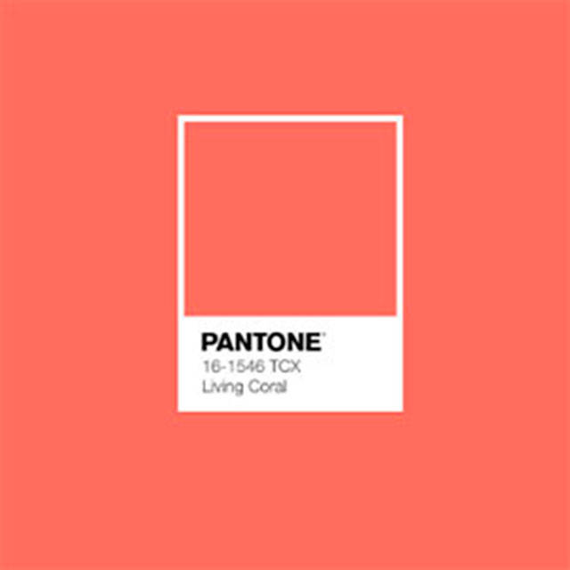
Pantone’s choice for the 2019 Color of the Year — “living coral” — was described on the company’s website as “an animating and life-affirming coral hue.”
The decision was both quickly cheered and jeered. Slate magazine called it a “hilarious misfire,” among other criticisms.
“It’s true; it’s always very controversial,” said Kelly DuByne, who runs Distinctive Designs in Lake Stevens and has taught classes on the psychology of color.
She said she thinks of the color as warm and vibrant, but “I wouldn’t be painting my walls with it.”
Designers need to know what’s being talked about with color trends, she said. Customers sometimes ask about them yet rarely talk about painting their whole house the Color of the Year. “But you can incorporate the Color of the Year into your accessories,” DuByne said.
For those for whom coral just isn’t their thing, there are a number of other choices.
Paint companies, such as Behr, Sherwin-Williams and Benjamin Moore have their own annual colors of the year.
For Behr, the color is called “blueprint,” for Benjamin Moore it’s a gray tone called “metropolitan” and for Sherwin-Williams, it’s a terra cotta color called “cavern clay.”
Richard Johnson at Hatloe’s in Everett said that the announcements “usually bring people in asking about that particular color.”
It’s an entry point to start a discussion with design staff who specialize in design and color questions.
Customers are shown a color card to check its actual hue with what they may have seen advertised as the Color of the Year.
“Quite often we sell paint in that color,” Johnson said. They’re often sent home with a small sample of paint.
“There’s nothing like painting a swatch of the color in your own home,” he said.
Benjamin Moore’s metropolitan, for example, is a color that will “look a little different depending on the light you have,” he said.
The gray-hued paint could be more of an accent color, coupled with a nice soft white for the ceiling.
A Color of the Year often is a reflection of what’s going in the economy, DuByne said. Pantone chose “mimosa” as its Color of the Year in 2009, looking at renewal and optimism in a year that economists said marked the end of the Great Recession.
The color in 2017 was called “greenery,” reflective of nature and the outdoors, she said.
“There’s meaning behind the the colors,” DuByne said. “It’s fascinating how they pick it.”
She said the questions she often asks customers considering a color change inside their home is what they want to feel in the room and what activities will go on there.
Pantone’s coral color is a happy, active color, she said. An office space might call for a light green or mid-tone to be calming and peaceful, she said.
People thinking about changing the colors in their home often get overwhelmed with the choices.
She said she recently talked with a woman whose walls hadn’t been changed from beige for about 20 years and had started to take on a pinkish tone.
They ultimately settled on a gray from Sherwin-Williams. “Gray continues to be a very popular,” DuByne said.
Color is kind of a puzzle, she said. “Ask questions. Look at the existing furniture and artwork — things that are there on a more permanent basis.”
Finding the perfect color is more than just going with whatever the current color trends may be. “They also have to love the color, too,” she said.
Sharon Salyer: 425-339-3486 or salyer@heraldnet.com.