The woman who picks the Color of the Year lives on Bainbridge Island.
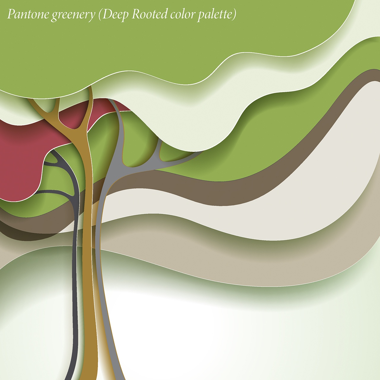
When Pantone Color Institute executive director Leatrice Eiseman announces the color, fashion and interior designers around the world listen up. Pantone calls this year’s color “Greenery.”
The spring-green hue is about new beginnings; an expression of cultural moods and attitudes on a global scale, the company says.
“Greenery bursts forth in 2017 to provide us with the reassurance we yearn for amid a tumultuous social and political environment,” Eiseman said in the Pantone literature. “Satisfying our growing desire to rejuvenate and revitalize, Greenery symbolizes the reconnection we seek with nature, one another and a larger purpose.”
You get the idea.
Or at least interior designer Tara Buchanan gets it.
The owner of Tara B Designs in Everett, Buchanan pays attention to Pantone’s annual announcement about the color that sets the tone in design.
Watch, said Buchanan, you’ll see the color everywhere.
“It’s a good color this year. Greenery is a happy, warm green,” Buchanan said. “It pairs well with white subway tiles. It’s very fresh. It’s delicious.”
Greenery also mashes up well with lots of other colors, she said. It’s a good accent color, too.
“Emerald was the color in 2013. It was a bit too dark. In the Northwest we need that bit of gold in the green,” said Buchanan, who also stages homes for sale.
“Eiseman is observing nature and our mood,” she said. “Going green in everything we do is big, and she hit on a happy green that we need right now for our society.”
Buchanan has been to Pantone workshops led by Eiseman.
“She is like a goddess,” Buchanan said with a laugh. “I would love to spend a day with her, that would be bucket-list day.”
Krista Miller of Beach Glass by K. Miller Interiors in Mukilteo is a bit more ambivalent about Pantone’s Color of the Year.
“How much I care depends on the color,” Miler said. “Fashion is highly influenced by Pantone. It’s amazing how this happens. I go to market each winter, and there is the Pantone color in scarves and all kinds of things. Everywhere. People rush to use the color.
“But with my clients I am careful they don’t invest too much unless they just like the color anyway.”
Miller believes this year’s Pantone green — a neutral color that brings the outdoors in — will appear in lots of accents, such as pillows, linens, wallpaper and painted accent furniture.
“I could see it used as a front door color or in the kitchen,” Miller said. “I really like some of the blues that Pantone suggests to pair with their new green.”
Other popular colors this year will be eggplant and then gray mixed with bright colors, said Jill Duchow, the design consultant at Hatloe’s in Everett.
“Our new paint color ‘Green Thumb’ is very popular right now and it’s very much like Pantone’s ‘Greenery,’” Duchow said.
Pantone’s 2016’s colors were “Rose Quartz” and “Serenity” — light pink and a light blue that Eiseman said was inspired by the colors of her fading hydrangea.
As Pantone encourages: “A constant on the periphery, Greenery is now being pulled to the forefront — it is an omnipresent hue around the world. A life-affirming shade, Greenery is also emblematic of the pursuit of personal passions and vitality.”
More about Pantone’s Color of the Year is at www.pantone.com/color-of-the-year-2017.
Talk to us
> Give us your news tips.
> Send us a letter to the editor.
> More Herald contact information.