
Edmonds sign saga: Locals chime in on ferry, seagull, font
Published 1:30 am Wednesday, April 3, 2019
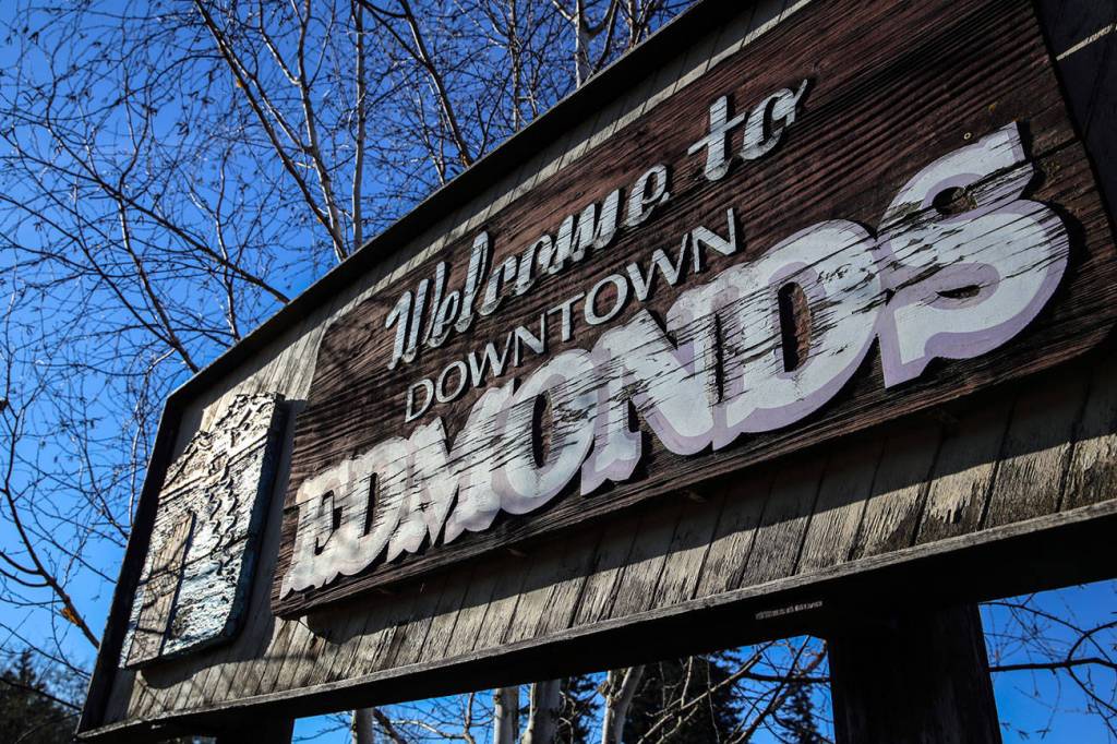
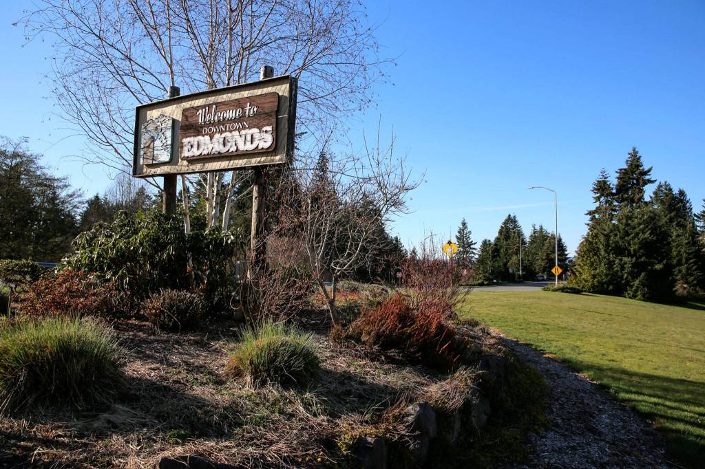
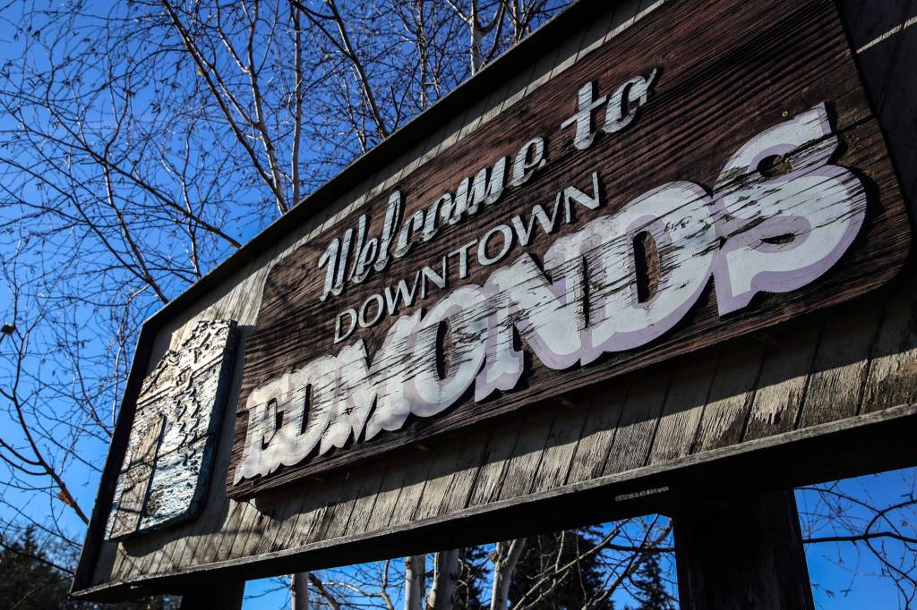


EDMONDS — The city’s aging, weathered “Welcome” sign has become a metaphor for the times.
Residents are clashing over whether its replacement should be fridge-magnety quaint or Northwest finesse. Ferry or no ferry. Seagull or evergreen trees.
Cursive writing is another sticking point.
Yep, it has come to that.
The only thing in agreement is that the 40-plus-year-old gateway sign at the junction of Edmonds Way and Fifth Avenue South has worn out its welcome. The $10,000 allotted for a replacement is coming from the city’s parks department capital budget.
Another public meeting is being held after yet another anonymous online poll. The latest survey results have been reviewed by the sign advisory committee, which will offer findings at Thursday’s 4 p.m. meeting at the Frances Anderson Center, 700 Main St.
“We will take guidance from the committee,” said Carrie Hite, the parks director.
For many motorists, the current sign is more of a blur by the side of the road than a roadside attraction. It’s brown, with big weathered letters and a small ferry sailing away from town, toward mountains.
The surface is cracked and peeling beyond repair, Hite said. “We have fixed it up quite a bit over the years, but it can’t be fixed up anymore.”
The city hired Clayton Moss, of design firm Forma, to come up with a new sign last year. Forma did signs for the Hazel Miller Plaza and other places in Edmonds.
The first Moss proposal last summer was a sleek sign with lighting. Some people didn’t like it.
“They thought it was too modern,” Hite said. “So it was enough of a conversation we decided to hit the pause button and take a few steps back.”
A nine-person sign committee was formed.
Others wanted a say-so.
Old school sign painter Mack Benek, whose art can be seen on windows and signs around town, was asked by local businessman Mike McMurray to create a sign.
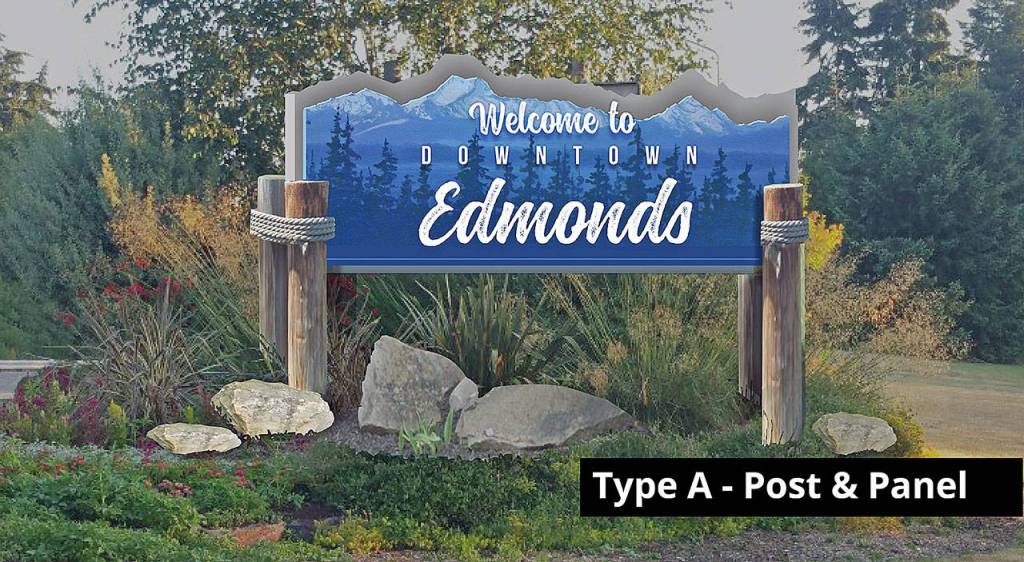
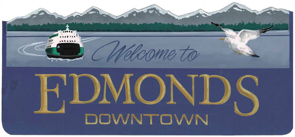
Benek designed a prototype for a post-and-panel sign, similar to what is there now, but in blue, with a large seagull and ferry.
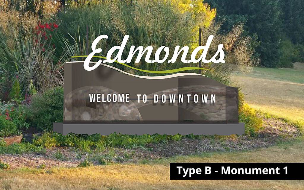
The post-and-panel sign by Moss is earth-toned, with a tree-lined background, water (no ferry or gull) and mountain silhouette by muralist Andy Eccleshall.
In the recent online survey, the two panel signs were the top choices.
The design by Moss garnered 44 percent of the vote, with 576 as first choice and 338 as second choice.
Benek’s sign had 29 percent, with 381 first-choice votes and 280 as a second choice.
A contemporary monument-style design by Moss came in third, with 16 percent. Another Moss monument placed last with 5 percent.
The final design will go to the City Council for approval. The hope, Hite said, is to have the new sign up by mid-summer.
“There is so much passion around it,” she said.
Comments on the top designs included:
“Skip the bird, too cluttered.”
“Inclusion of the ferry and seagull which are iconic Edmonds symbols makes this one the most ‘Edmondsy.’”
“Wish that this design did not use cursive lettering for Edmonds; kids can’t read that anymore (not being taught in school) and they love to read the road signs.”
“It’s no longer 1950.”
“A little cheesy and antiquated.”
“Should reflect ‘Edmonds Kind of Day’ spirit.”
“The trees are part of the beautiful views; without them, the ‘view’ is naked.”
“Too much modernity does not fit with the character of Edmonds. People come here to escape modernity and its trends.”
“Kind of looks a little like a license plate.”
“I like that it does not include the ferry. The ferry icon is overused.”
Andrea Brown: abrown@heraldnet.com; 425-339-3443. Twitter @reporterbrown.