Millions of people around the world drink from her cup.
What’s up with that?
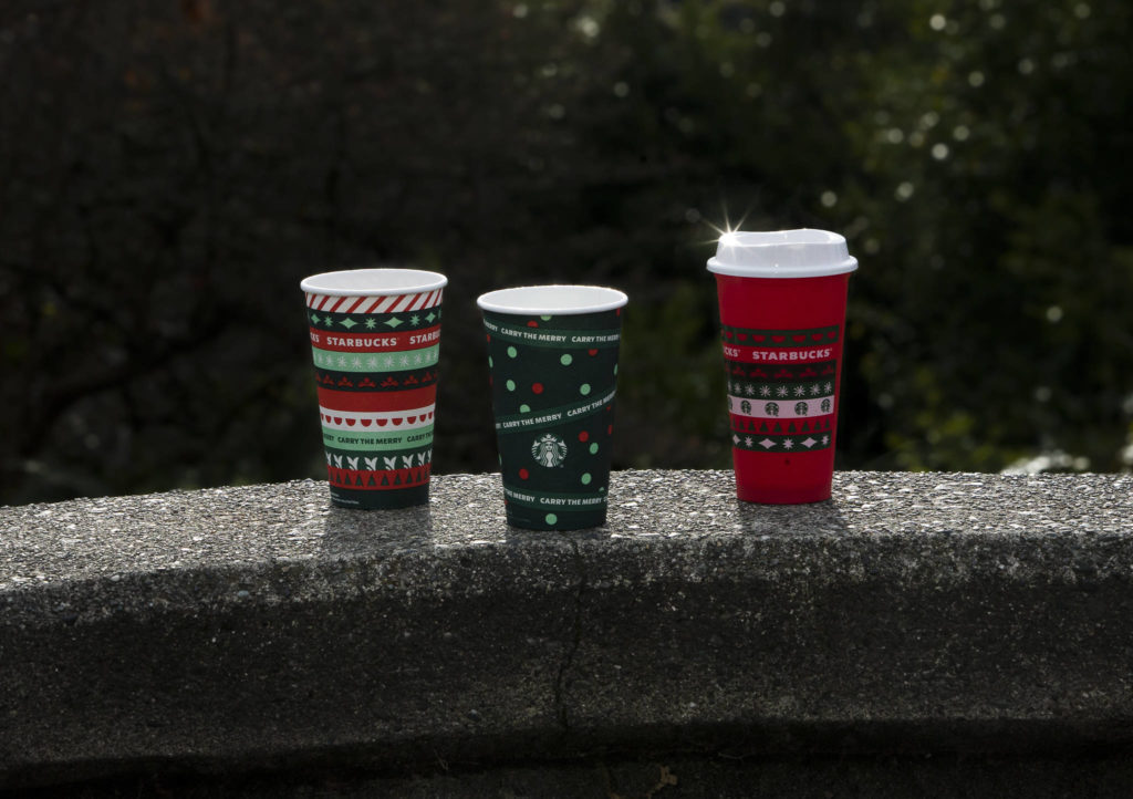
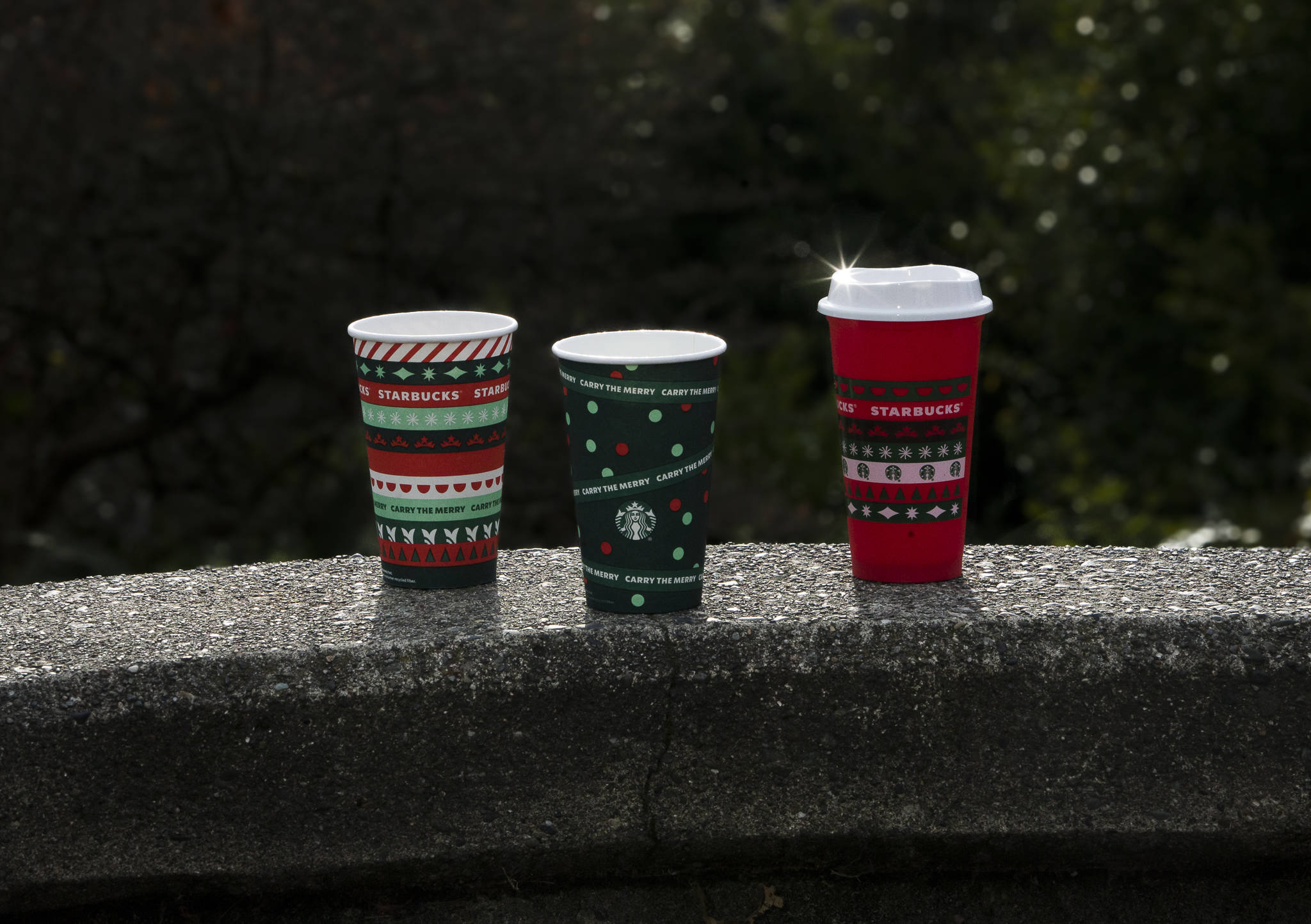
Taylor Mattson, who hails from Everett, designed two of the season’s four Starbucks red cups that are caffeinating the masses in this coffee-est time of the year.
The colorful cup with a striped ribbon pattern that evokes a holiday sweater is her doing. Her other cup is green with polka dots.
The cups are titled Ribbon and Dot.
Yep, these cups even have names. After all, they are pop culture phenoms.
About 400 million red cups were printed this year just for U.S. and Canadian Starbucks. The Ribbon cup is the only one also used all over the planet. The design even dons the limited-edition reusable collectible cup.
The annual red cup ritual at Starbucks started in 1997 with a hand-drawn holly design offered at its then-1,400 coffeehouses. Now, with 30,000 stores, the cups are Instagram props and the drinks are frilly.
Mattson said friends from Scotland and Hong Kong tagged photos of them with her Ribbon cup.
Her mom, Joan, spread the word the old-fashioned way.
“The day they launched she sent me a photo when she was in the drive-through of a guy walking on the street holding a cup, and she said, ‘I yelled at that man saying, ‘My daughter designed that cup,’” Mattson said.
She credits her dad, Paul, with taking her to after-school art classes in Seattle when she was a kid.
Her parents still live in the Everett house where she was raised with big sister Cory, a softball standout who was The Herald’s Player of the Year in 2006.
“My sister was more the athletic type and I was the creative type,” she said.
Mattson went to Western Washington University after graduating from Everett High School in 2011.
“I originally wanted to be a teacher but a few quarters in I realized it wasn’t quite the right fit,” she said. “I’ve always been drawing and painting as far as I can remember. I never realized I could get a job in design until I was at college.”
A TV show about Madison Avenue was inspiring.
“I remember watching ‘Mad Men’ about advertising agencies in the ’60s, seeing the VW ‘Lemon’ ad and just thinking, ‘Wow, that is so creative, how did they come up with that?’” she said. “Advertising is this weird space of art and marketing and finding a good way to communicate ideas and visuals.”
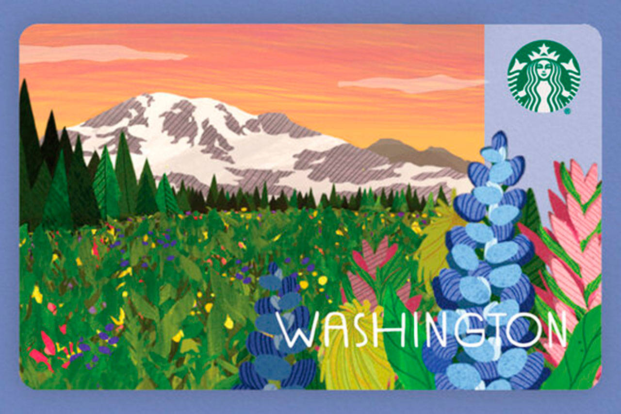
A Washington Starbucks gift card design by Taylor Mattson, a 2011 Everett High School graduate. (Starbucks)
As a student intern at Starbucks in 2015 she designed a gift card based on a doodle in her notebook.
“I was able to make a gift card, which was so exciting to me,” Mattson said. “It was something that someone could hold, a real product. That started that itch. I was able to work on real products.”
She was hired by Starbucks after graduation in 2016.
“The first two years at Starbucks I was on the gift card team specifically and that was a perfect world for the drawing and painting fine art habit I always had. It was a perfect little canvas,” she said.
No matter that it wasn’t something that people hung on the wall over the couch.
“Hearing that people have loaded $12 million to a gift card you designed is a crazy feeling. We get numbers of how the gift cards do,” she said.
Mattson designed more than 50 gift cards.
“It is humbling how many interact with your product,” she said. “Just seeing them out on the wild, it is always exciting to go into a Starbucks and see my gift card or see someone pay with a gift card I made or walk up to order something and see it right there.”
She is modest about it in public. Others, not so much.
“Every once in a while I’ll go to a store with family or a friend and they hold it up and go, ‘She made this!’ and I’m just like, ‘They don’t care,’” she said.
Oh, yes they do. At Alderwood mall on Monday, Starbucks customer Ronald Ranko was impressed when told his cup was designed by someone raised in Everett.
Ranko, a Lynnwood retiree, got the Ribbon cup with his usual decaf hot brew with cream and about five packs of sweetener, his reward after doing laps at the mall.
“The design on it is festive,” Ranko said. “If that was a sweater I’d buy it.”
Mattson said work on the holiday cups for 2020 began in the summer of 2019. A colleague designed the other two red cups. “We collaborated back and forth to make sure the whole suite was a holistic story,” Mattson said.
This is art shop rocket science.
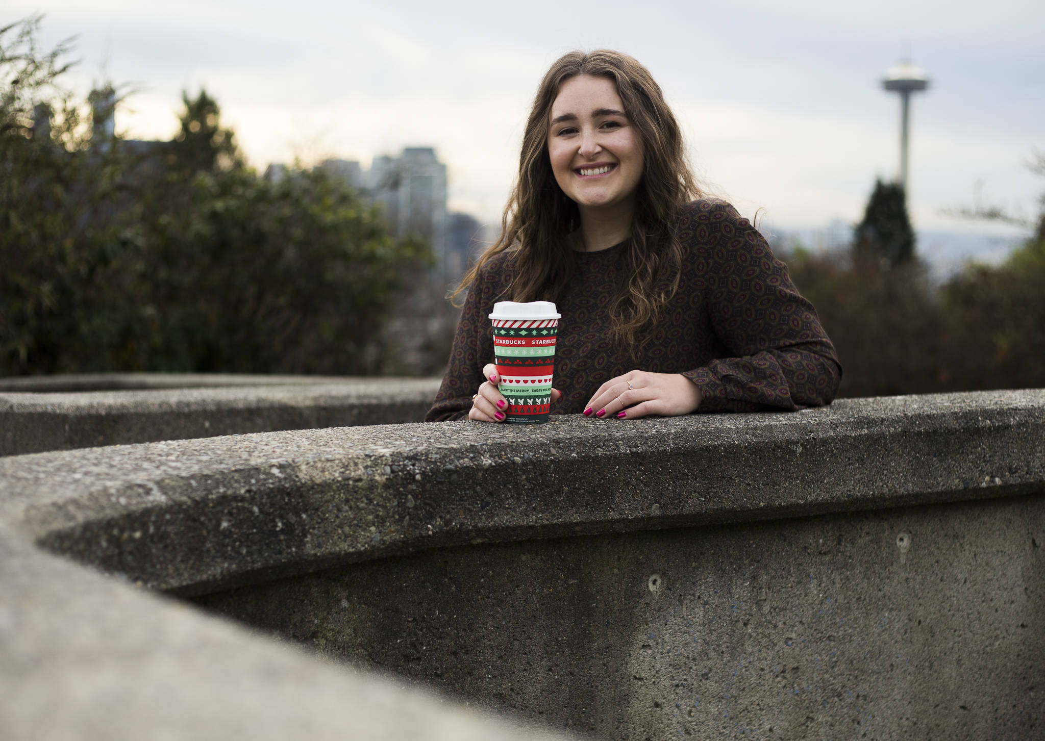
Taylor Mattson’s designs are on paper coffee cups and a holiday season collectible reusable cup. (Olivia Vanni / The Herald)
“We probably designed over 50 different cups,” she said. “There’s a lot of forecasting when you are designing over a year in advance to make sure it is going to be relevant and on trend, so there’s a lot of research and paying attention to fashion runways and just seeing where all the color trends are coming from.”
The presidential election factored in.
“We were accounting for a little emotional turmoil, regardless of how the election swung. We knew there was going to be a lot of the population in good spirits and bad spirits,” she said. “Part of the idea was just giving people that escapism.”
The pandemic was an unexpected wild card, but it made the cups more special.
This year’s theme is “Carry the Merry.” A copywriter came up with that slogan.
Ribbon and Dot are her bundles of joy.
“Nothing I’ve made compared to the red cups,” Mattson said. “Knowing that people in Hong Kong are ordering coffee in cups I designed, that’s mind-blowing to me. Even just walking around Queen Anne and seeing people holding that is just still surreal.”
Andrea Brown: abrown@heraldnet.com; 425-339-3443. Twitter @reporterbrown.
Talk to us
> Give us your news tips.
> Send us a letter to the editor.
> More Herald contact information.
Gallery